Mobile First Design
Sources
Overview
Around 2010, as smartphones were cementing their place as the replacement for flip phones, the demand for mobile access to the internet increased, prompting web developers to recognize a need for websites to cater to a different user experience. Eventually Ethan Marcotte proposed a methodology for designing websites in a blog post called “Responsive Web Design” (Mor-Samuels), which seemed to comprehensively explain an approach to designing websites that emphasized layouts that could translate to any screen size. Later on, Google started prioritizing websites with better mobile experiences for users, thus setting the precedent that websites should strive to create excellent mobile designs for their websites.
Mobile First Design is a philosophy that aims to start with designing a website from the smallest screen size that would then get translated to bigger screens afterwards. By taking this approach, it focuses designers on the most pertinent information and features, making them more accessible to users right away.
Examples
Nike has both a mobile-first website and app (Mor-Samuels). It encourages users to download the app, which could then get them exclusive offers and rewards.
YouTube's dark mode and button spacing take into consideration smaller screens, attempting to reduce user's eye strain (Kagad)
Airbnb and Google use card design to group information and deliver it in a short, user-friendly way. "It's a design approach that simplifies the user experience by presenting information in bite-sized, visually appealing chunks, promoting quick understanding and decision-making" (Kagad).
Motivations for Implementation
A mobile-first approach to design would ensure a good user experience at every size of the website. With Graceful Degradation, where the design of the desktop comes first and then everything is sized down, certain elements might be lost or watered down to fit smaller screens, resulting in a diminished experience for mobile users. By starting at the smallest screen, designers can make sure mobile users aren't left out of experiencing all that a website seeks to offer them.
This in turn allows mobile-first designs to be more accessible. By considering a mobile user's needs for readability (Muzyka) and what they can comfortably reach within the what Misba Kagad refers to as the thumb zone, mobile-first designs allow more people to comfortably use their websites.
Impacts on Industry
Almost 5 billion people are active mobile internet users (Muzyka), and over half of all internet traffic comes from mobile devices (Unadkat). And both numbers are set to keep increasing, so it makes sense that, as more and more business is conducted via phone or smaller screen, having a mobile friendly site is a must have for companies and businesses to reach their target audiences. Therefore, as web designers and developers, we'll be expected to know how to build those websites and applications and make sure they work properly.
Personal Opinion
I find this philosophy impacts a lot of people whether they put it into practice or not. Since mobile traffic on the internet is increasing and will probably keep doing so, I find that it's a safe bet to make that companies want to have some sort of focus on making their websites mobile friendly. Whether you're part of the team that designs it or the team that implements it, you'll have to think about making the website or application work for a variety of small screens at some point. Personally, my goal is to get better at practicing it, even though my first inclination is to start with designing for desktop.

Motion UI
Sources
Overview
Motion UI can refer to both a web design concept and a Sass library. The concept revolves around use of motion elements in a website to enhance the user's experience, while the Sass library is intended to make it easier and smoother to incorporate animations into a website's UI.
The concept of motion UI grew from the use of motion elements as purely decorative accents to a principled discipline that sees motion as a form of engagement for the user. It can further break down into different types of motion, three of which are animation, transitions, and micro interactions.
Motion UI as a Sass library is attributed to ZURB, a design and development agency, and was introduced to the public back in 2015 and became open source around 2017. It allows users to incorporate pre-built animations and transitions without having to code their own JavaScript to make it work smoothly.
Examples
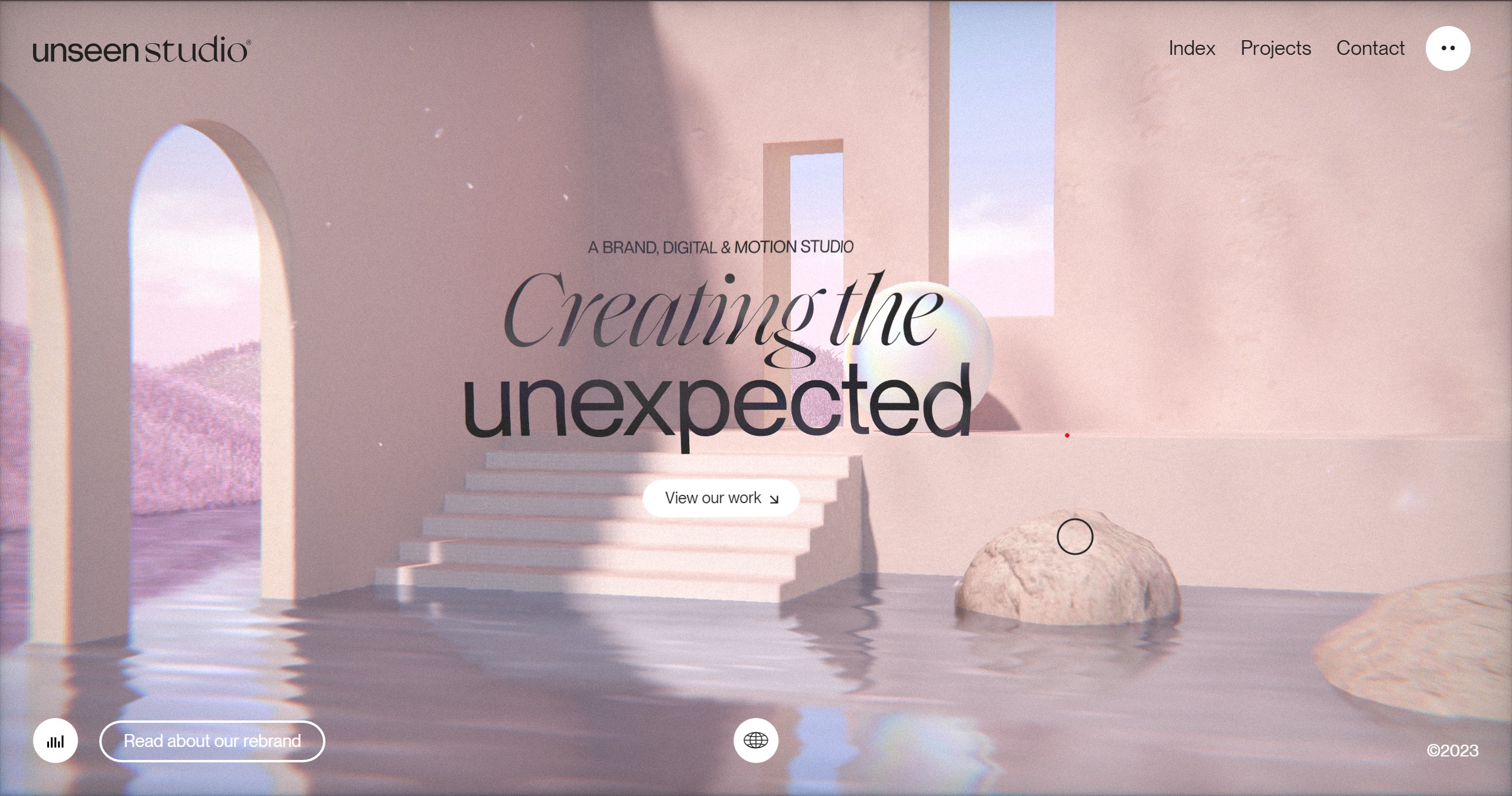
Some websites, like one I was recently introduced to - unseen.co, use animation and motion to make the website immersive. And a lot of functions that we see today on websites will fall under the principles of motion UI. Drop down menus, animated infographics, and progress bars are a few familiar elements that websites use help engage visitors, while some newer uses of motion UI include scroll-triggered animations, hover effects, and parallax scrolling effects.
Motivations for Implementation
Using the principles of motion UI, designers can highlight certain aspects of their websites, which would allow them to create a visual hierarchy of design elements. It would also allow them to help guide users around the website, while also making it more engaging. Other benefits to motion UI include increased user engagement and brand recognition, which can lead to repeat visits and longer retention rates.
Impacts on Industry
Since “our brains are hard-wired to respond to movement” (Design + Creative), dynamic elements and even small, subtle animations and transitions are trickling into even the most static of websites to attract and keep users' attention. And due to a general decrease in attention span (VIPE team), newer websites seeking recognition will want make use of motion UI principles to make their users' experiences memorable and engaging.
Personal Opinion
I personally really enjoy experiencing and creating animations and transitions for websites, probably because I've liked playing video games since I was young. That kind of experience with being engaged in a virtual environment that I could affect makes me happy to see that websites and the internet in general is moving towards creating that kind of interactive environment for everyone else. When it comes to the Motion UI library, I'm curious about whether it will allow me to expand my animation capabilities, and whether it indeed makes it easier for developers to incorporate animations.

GraphQL
Sources
Overview
GraphQL is a query language and a runtime for API's that was developed by Facebook and released to the public in 2015. It was built using the principles of Graph Theory, which are “a set of mathematical concepts that describe how networks of objects (nodes) interact with each other” (Bell), and can be used with existing infrastructure according to Harsh Bothra. Similar to REST API's, it allows users to make a request to a server and receive a response; however, according to Harold Bell, GraphQL can make manipulating data from servers more efficient and flexible. It accomplishes this by making one request, instead of having to make multiple requests for different types of information.
Examples
(All provided by Tyler Charboneau)
PayPal has been using GraphQL since 2018, which has helped them standardize their approach to their UI development.
Shopify has integrated more GraphQL in its Admin API, creating a smoother experience for external developers, especially when it comes to client-server data mapping.
Coursera developed a “a GraphQL assembler service” to be able to communicate between their different APIs.
Motivations for Implementation
One of the advantages of GraphQL is its ability to make requesting data more compact. You can ask for multiple things in one request and get one response back. This leads to having just one endpoint, instead of the multiple you might need with REST APIs, which can save time and effort when servers process data from clients. It also has simpler syntax and is “designed to be language-agnostic” (Richardson Ellis), so it's supposed to be easier for developers to incorporate into their code.
Harold Bell mentions that there isn't an official standard to using GraphQL, so it may be difficult to find resources that would make working with it easier. Bell also mentions that the fewer endpoints that GraphQL generates might create more work in making requests because it's geared towards returning smaller pieces of data.
Impacts on Industry
According to its own website, a whole slew of companies have integrated GraphQL in their development, some that weren't mentioned in the examples being Airbnb, Dailymotion, Lyft and GitHub. As it makes requests to servers and communication between APIs easier for clients to handle, it looks like a promising query language to use for a wide variety of industries. Being designed to work across languages and platforms also makes it an attractive tool to use for developers and companies.
Personal Opinion
I have little to no experience working with REST APIs, which are the more common interfaces being used for now, so I was intrigued when I came across a mention of GraphQL. It seems like a promising query language since it can simplify and condense requests, and I appreciate that it has easier syntax, making it more friendly to learn.


